Climate Spiral

March 15, 2022
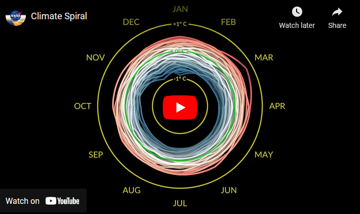
This visualization shows monthly global temperature anomalies (changes from an average) between the years 1880 and 2021. Whites and blues indicate cooler temperatures, while oranges and reds show warmer temperatures. As you can see, global temperatures have warmed from mainly human activities as time has progressed.
These temperatures are based on data from NASA’s Goddard Institute for Space Studies (GISS). Anomalies are defined relative to a base period of 1951 to 1980. The data file used to create this visualization can be accessed here.
The “climate spiral” is a visualization designed by climate scientist Ed Hawkins from the National Centre for Atmospheric Science, University of Reading. Climate spiral visualizations have been widely distributed; a version was even part of the opening ceremony of the Rio de Janeiro Olympics.
Was this post helpful?
- Published by: NASA's Scientific Visualization Studio
- Source website: https://climate.nasa.gov/ Video: Download video